These are a few pictures from this year’s Abstract Line Unit. Enjoy!
Tag Archives: watercolors
4th Grade: Abstract Self-Portraits
Leave a comment
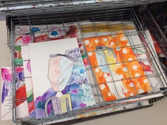
For this lesson, students combined what they learned about portraiture and abstract art to create an Abstract Self-Portrait.
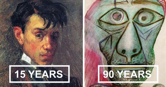
I began the project by asking “Why do artists try new things?” and “How does art evolve over time.” I showed students 14 self-portraits that Picasso made over his life time, from age 15 to age 90 and talked about how his style changed over time. Then I showed additional examples of expressive portraits.


After watching the presentation, students began brainstorming ideas for their portrait. I printed out a few lists of different emotion words and pictures of different feeling faces for students to reference.


Next, students began sketching their final draft. At this stage, they needed to decide what materials they would be using for their final draft and what paper they would need (drawing paper, watercolor paper or construction paper).


After drawing their composition with color, students chose how they wanted to color their picture–either with crayons, markers, colored pencils, oil pastels, watercolors, collage, or a combination of materials.
Once they finished creating their portrait, each student wrote four sentences describing their work.
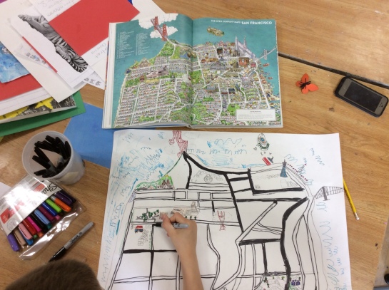
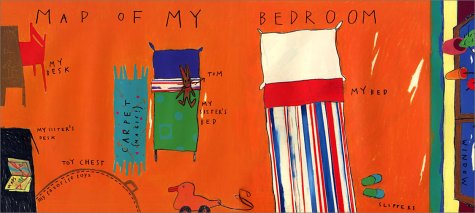
2nd Grade: Marvelous Maps
I love giving students choices in class, because I am often inspired by their ideas and use what they create to come up with lesson ideas.
This year, I had a student who earned extra choice with me if he met his behavior goals and earned a certain number of points. He earned this special time a few times this year and on his 3rd or 4th visit with me, he decided he wanted to create a large map of San Fransisco. I was all for it and we began to draw.
A few weeks in, I decided that I wanted to do this lesson with the rest of the second grade for their final project of the year. As inspiration, I showed students a short PowerPoint with a few samples of maps and images of some of the different parts of a map.
I also read the book My Map Book, by Sara Fanelli. Students were prompted to make a map based on a real or imaginary place. I wanted to see what would happen if students could make a map about anything.


They created a sketch and then began working on their final version. The requirements were that each map needed to include a title, pictures or symbols and words (a key or labels).


There was a wide range of responses to this prompt. After looking at student work, I’ve been reflecting on what I would change when I teach this lesson again. Some of the ideas that students came up with were really original and interesting, but some of their final pieces didn’t really look like a map–they didn’t show physical features and wouldn’t help someone navigate the area.
Students enjoyed the freedom to “make what they wanted,” but I think they could learn more in the process. I would definitely do a demonstration of how to draw roads and lakes and make each student create a key. This would guarantee that every students include symbols/pictures in their map. I would also talk more about fonts when creating the title. I checked out a bunch of books from the library, and would tweak the handouts/samples that I printed so students have better resources at their fingertips.
Managing Materials: Watercolors
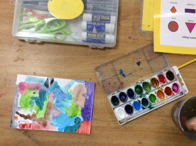
I love watercolors. They’re simple to use and they allow students to focus on painting without have to spend time mixing colors. (Have you ever had a student spend 15 minutes mixing one color only to have to clean up as soon as she is ready to use it?). I also use tempera and acrylic paints with younger students, but I often wait until a little later in the year when routines are established and they can manage getting, using, sharing, cleaning and returning more supplies.


Because students usually use watercolors without mixing colors (although you can also mix them!), I like to give them a variety of colors. A few years ago, I bought some new sets of Crayola Watercolors, 16 Color Set. The one thing I don’t like about this set is that the pans are not refillable. (The Crayola Watercolors, 16 Brilliant Colors Set is, but it’s almost twice as much and doesn’t have a clear cover, so you can’t see the colors until you open it.) Luckily I had a bunch of extra single-strip plastic watercolor strips. After a using the sets for a year, a lot of colors were empty, so I replaced the non-refillable strips with refillable ones. I also ordered Crayola Watercolor Refills and Prang Watercolor Refills to replace colors as they get used up. (Because certain colors are more popular than others and run out more quickly.)


In order to keep all of my refills organized, I sort them into an old marker box. (I love marker boxes and use them for so many different things.) This way I can see when a color is running low and when I need to order more refills.


Because watercolors are so popular, I try to clean the containers every few months to keep the trays clean and the colors fresh. Here’s what I do:
- Take out the plastic strips.
- Wash the watercolor containers.
- Set the containers in the drying rack to dry.
- Replace the plastic strips.
- If the strips are really dirty and I’m feeling ambitions, I’ll pop out all of the tiny refill pans, wash the plastic strips and then refill the colors (and replace the ones that have run out).
What are your favorite supplies? What creative solutions do you have for managing supplies and minimizing costs?
ATC Mini-Lessons

This year, I’m introducing ATCs to 2nd, 3rd and 4th graders. I’m starting the year by giving students a couple of assignments. My hope is that these assignments will encourage them experiment more throughout the year and make cards that are more thoughtful and “complete” when they are given choice time.


2nd Graders: Oops! Card
For this lesson, I read the book Beautiful Oops!, by Barney Saltzberg. I talked with students about what choices an artist has when he/she makes a “mistake.” Next, I showed students a few Daily Monster videos and challenged them to turn an “oops” into something new… something scary, or friendly, or beautiful, or funny, or… just about anything they could think of! Students started by transforming their oops with pencil and tracing with Sharpie. Then, they added a background and colored in their ATC.


3rd Graders: Sky Color
For this lesson, I read the book Sky Color, by Peter Reynolds. We discussed that the sky is not always blue and then I demonstrated a few watercolor techniques… painting wet on wet, wax/oil watercolor resist, sprinkling salt, and blotting with a sponge brush, q-tip, paper towel, or bubble wrap. Then students set to work creating an ATC of a type of weather or time of day.
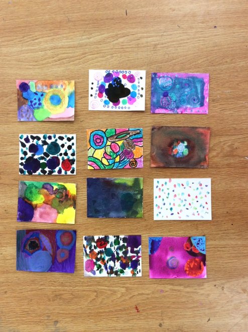
4th Graders: Abstract Dot Composition
For this lesson, I read the book The Dot, by Peter Reynolds and discussed how students might “make their mark.” After showing abstract spot and dot artworks by Wassily Kandinsky and Yayoi Kusama, students were challenged to create an abstract composition made entirely of dots. Students could choose to use Sharpies, markers, crayons, watercolors, or a combination of materials. **For this lesson, I also showed examples of this lesson from Mrs. Knight’s Smartest Artists.
2015-2016 Recap
I took a break from blogging last year to focus on setting up my Twitter and Instagram accounts. Another reason I took a break is that my district has not been able to successfully negotiate a contract for over two years. During negotiations, one of our district-wide union actions was to limit our communication with parents. While we still don’t have a contract, I find that in addition to helping communicate with families, blogging helps me on a personal level. It provides a chance to take time to look at what my students are making (and thinking! and feeling!) and reflect on my practice. Blogging also helps me connect with other teachers and dissever new ways of making and thinking about art.
Because of this, I’m going to start blogging again this year. I hope that our action team continues its hard work and that our contract is negotiated soon. We deserve a fair contract. In the mean time, here is a look at a few of my favorite memories from last year…


See more pictures and updates @artwithmsem (on Twitter & Instagram). 🙂
Kindergarten: Name & Age Watercolors
 Kindergarteners started a painting and color mixing unit last week. Their first assignment was to write each of the letters of their name and their age on their paper with oil pastels. Then, students traced their letters with sharpie to create block/bubble letters. Last, students painted their pictures with watercolors. While they painted, students practiced cleaning their brushes before choosing a new color.
7th & 8th Grade: Artist Trading Cards

7th and 8th graders were challenged to design an Artist Trading Card for each of the 7 elements of art and principles of design. Each card has the definition of the word it illustrates glued to the back of it. The goal was to see how much students knew/remembered about the elements and principles and to let them experiment with different art materials.
